Rapid Prototyping for a Physiotherapy App
How might we create a digital physiotherapy presence?
Project Overview
Task
We were given a brief that included real customer need help with the design of a physiotherapy app. The app was going to be quite new in its kind, servicing customers with online meetings with a physiotherapist, gamification exercises, VR and AR features, and we were encouraged to come up with new ideas to other solutions.
We were supposed to choose one area within the app to focus on. I chose Registration and Onboarding.
The Brief
A client wishes to create an app that will enable the patient/user to engage with a physiotherapist digitally, and to be able to follow personalized exercises in the app
With the brief we could choose from two different pesonas, and look at some design files from the client to follow the design he wanted.
Solution
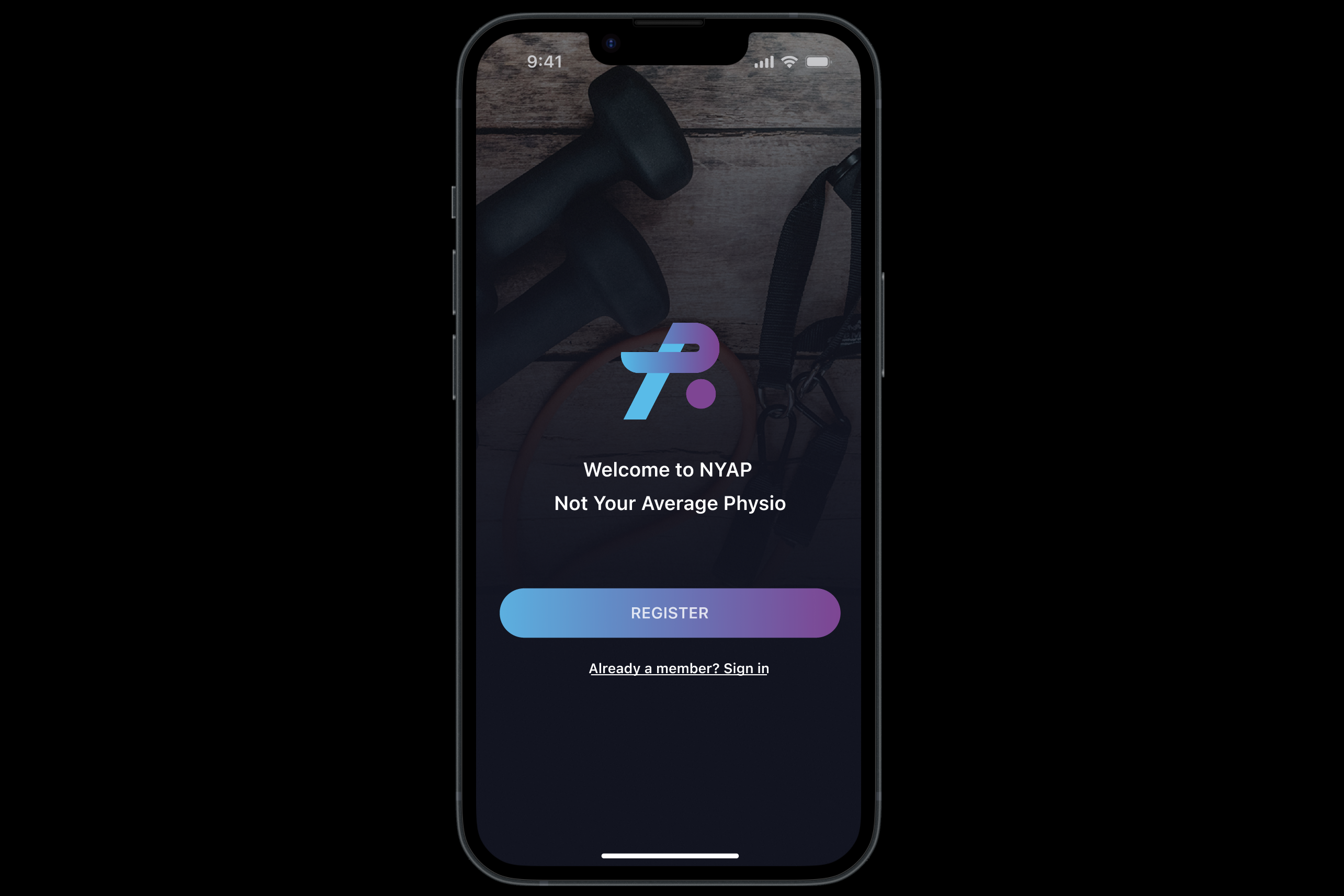
My solution for this project was, with the use of some of the colors from the customer/stakeholder, a registration/onboarding journey in app format.
Role
Time
Tools
Team
Scope
The process
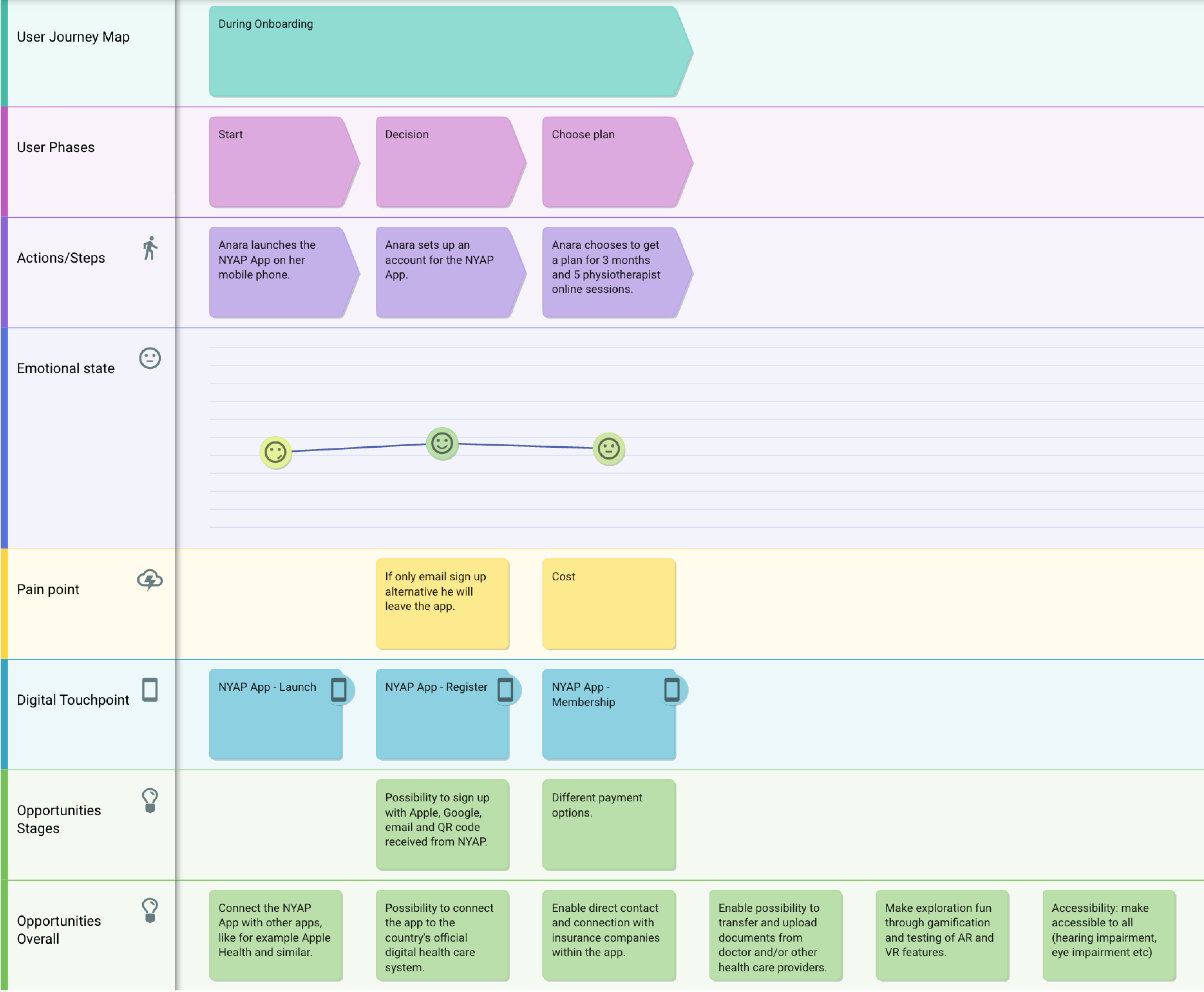
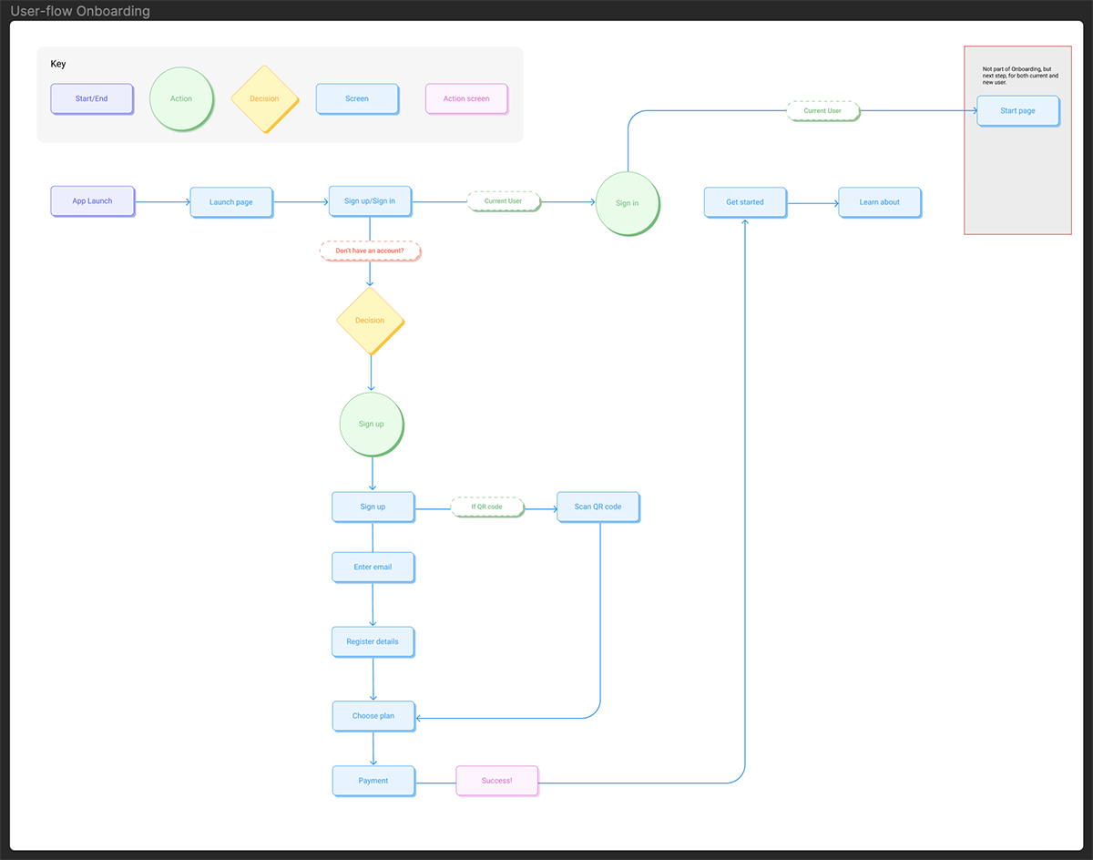
After a first look at the brief and the persona, I decided to create the registration and onboarding process for the app. But first I started working on the User Journey Map.
- User Journey Mapping in Custellence and Figma.
- Pencil sketched wireframes
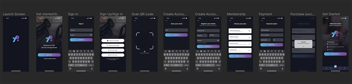
- Wireframes in Figma
- Design System in Figma
- Build the High Fidelity design in Figma
- Create the prototype in Figma
The Design Thinking Process
Also in this project I worked with the Design Thinking Process in mind since I find the process gives me a structure that keeps me on track, and also it helps keep the user in focus during the whole process, and also allows for iterations and mistakes.
Empathize: Persona and UJM
Since we were given two personas in the assignment to choose from, I decide to go with the persona who was a iOS user. This since I wanted to learn more about Apples Human Interface Guidelines (HIG). After that I started to create the User Journey Map. At first I started out creating my own UJM in Figma, but after a while realized that I had overcomplicated things, making the UJM too detailed. So after a tip from our teacher, André Brito, I started using Custellence UJM tool instead. This was so much quicker and easier to work with, so it optimized the work process immensely.
Define: Problem statements
In the Define stage I decided to come up with some problem statements to be able to see more clearly where a user might have trouble using a physiotherapy app.
Problem statements
- How might we create an onboarding experience that motivates and engages patients, encouraging them to consistently follow their treatment plans?
- How might we design an onboarding experience that educates users effectively on how to perform their exercises correctly and safely?
- How might the app's onboarding introduce a feature that facilitates easy access to professional advice when needed?
- How might we design an onboarding experience that is accessible and easy to use for all patients?
Ideate: Research and brainstorming
In this phase I had some brainstorming sessions in FigJam. Since it was an individual assignment I did this individually, but with some input from the teacher. I also had Mobbin.com to see examples of different onboarding sessions in apps. Onboarding seem to be interpreted in different ways, some just show registration of user features, and some see onboarding as a process where the user also learns how to use the app. I chose in the first step to focus on both, but due to time limitation I focused more on just a registration process, where the actual onboarding comes after registration. This was perhaps a mistake, but both processes need to be part of the app. It would have been more challenging to create the actual onboarding process.
Prototype: High Fidelity Mockup
As part of the task we were supposed to create a High Fidelity mockup, with a small Design System. We were given some design mockups from the client, showing what type of design they had in mind. I created my design system using the colors and style delivered from the client. See mockup here.
Test
The prototype was tested by peers and the teacher. And myself. After a few iterations I was content enough to hand the assignment in, but given the time limitations I would have wished for some more continuation on the project.
Next Steps
- Iterate on the mockup, creating a new version focusing more on another type of onboarding process.
- Add features to the onboarding process that educate the user effectively on how to perform exercises.
- Add personalization features to tailor the individual user's needs and preferences.
Reflections and Learnings
In hindsight it would have been good to create an "As Is" approached User Journey Map to show the user journey before the app's existence. Doing this would have helped in identifying clear opportunities for the digital touch points. Doing this could have made it easier to pinpoint the user needs better, and be able to address these by the UI design.
I also realized that I was not really focusing on the onboarding, but more a creation of the registration process. It should be more of an onboarding process, not just registration, although registration is usually part of the onboarding process.
I am very detail driven, which sometimes is a bit time consuming. I should do mockups and wireframes more rapidly, and then after design decision is made, focus on details in the design.